Screens
Proof
Outcome lift: did hot accounts actually turn into pipeline? The numbers, with methodology.
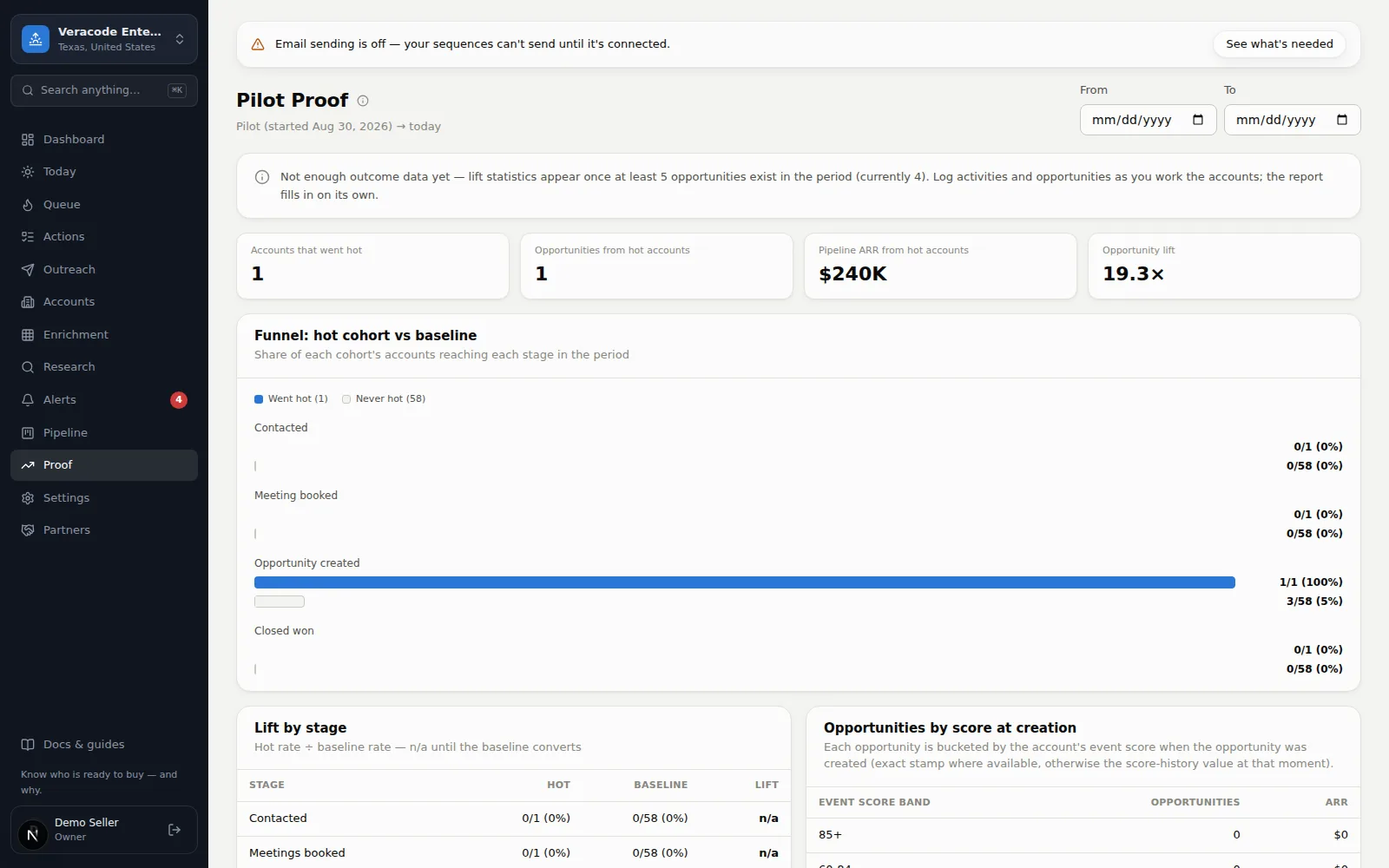
Proof answers the only question a pilot is really about: did the buying-event scores predict pipeline? Every number is transparent counting over your own logged data — no model, no weights — and every definition ships next to the numbers in the Methodology card.
Reading the report
| Section | What it shows |
|---|---|
| Headline lift | How much more often hot accounts (Event ≥ 85) became opportunities than never-hot accounts. Appears once at least 5 opportunities exist in the period. |
| Funnel | Contacted → meeting → opportunity → closed won, for the hot cohort vs the baseline, as shares of each cohort. |
| Lift by stage | The two rates side by side with the ratio — “n/a” until the baseline converts, never a fake number. |
| Score at creation | Every opportunity bucketed by the account's event score at the moment it was created. |
| Which signals convert | Per signal type: conversion rate of accounts that showed it vs accounts that didn't. Only signals that arrived before the account's first opportunity count. |
The period
The default window is your pilot start → today, so the report reads as the pilot scorecard. The date inputs re-run everything over any window.
Observational, not causal
Hot accounts are also the accounts your team worked hardest. Lift shows how well the score concentrates outcomes, not that the score alone caused them — the report says this about itself, in the API and on the page.
The report only sees what's logged in Diurno HQ: log calls, meetings, and opportunities as you work and the proof fills in on its own.